Oops I didn't mean to disappear for quite so long. Nothing much has changed on the home front, still hoping to sell the house soon, and occasionally I've found the time to do a little bit of sewing, sometimes I have the time but it's the last thing I feel like doing. Anyway, I have a finish, and I'm just going to come out with it. This is not my finest quilting hour. In the interest of keeping it very real on this blog and despite the fact that I would like everyone to think I'm perfect, bwah ha ha haaaaaaa, it's not all plain sailing here.
Many months ago I saw a wonderful quilt that was designed and made by Kirsty from You Had Me At Bonjour (don't you just love that blog name, it's perfect). I love Kirsty's quilt too, Modern Chevron, and thought it would be nice to try and make it in masculine colours.
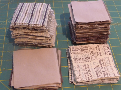
I chose my fabric, remember these? Hope Valley, Hometown and various grey solids.
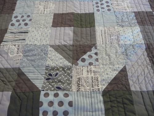
I started cutting and cutting, and cutting some more and laid it out on the "design bed" and thought hmmmmmmmm. I realised that the value contrast between the greys and the green/blues was notquite at all strong enough. I soldiered on. Mainly because my stash is already taking over my house and I didn't want to buy any more fabric. Ah, who am I kidding, I love buying more fabric, but I wanted to finish it and didn't want to go in search of more greys, and really, my stash is getting out of control.

It looked ok when I first started sewing the rows,
but by the time it was all sewn together arrgh, where's the pattern?

I hoped the quilting would help differentiate between the grey and the green/blues. It might have if I had chosen to quilt it differently.
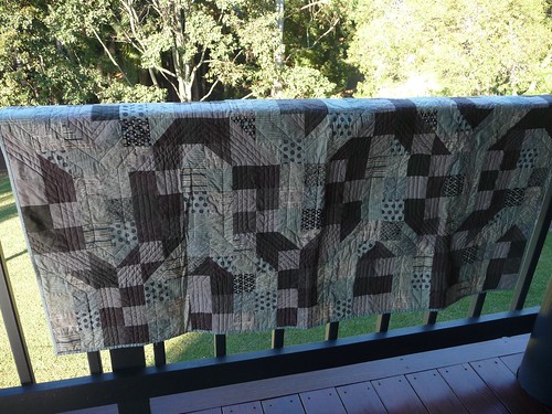
When starting the quilting I didn't think about the difference in width at the diagonal sections, that would have been helpful if I'd thought about that. I could have unpicked the quilting. I didn't. The quilting is pretty bad, especially in the diagonal sections, but it could be worse.


Here's the back, a Hometown print and a pieced strip of scraps.

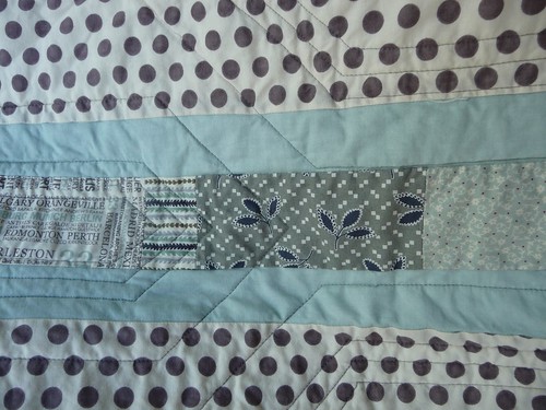
The binding is Pure by Sweetwater.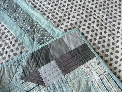
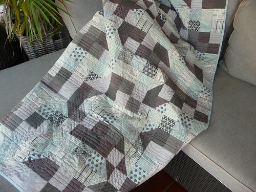
I'm chalking this up to experience........in what not to do. I haven't done Kirsty's pattern justice, but I do think it does make a very good masculine quilt. It's a pity the chevron pattern doesn't show up so well, but I do love the pattern and I suppose, to put a positive spin on it, it is interesting that the pattern is not obvious at first, but it kind of sneaks up on you, so I'm going to call it The Disappearing Chevron.
I recommend Kirsty's great design, she does a great tute, but remember to use high value contrast if you want it to look as fabulous as Kirsty's.
Many months ago I saw a wonderful quilt that was designed and made by Kirsty from You Had Me At Bonjour (don't you just love that blog name, it's perfect). I love Kirsty's quilt too, Modern Chevron, and thought it would be nice to try and make it in masculine colours.
I chose my fabric, remember these? Hope Valley, Hometown and various grey solids.
I started cutting and cutting, and cutting some more and laid it out on the "design bed" and thought hmmmmmmmm. I realised that the value contrast between the greys and the green/blues was not
It looked ok when I first started sewing the rows,
but by the time it was all sewn together arrgh, where's the pattern?

I hoped the quilting would help differentiate between the grey and the green/blues. It might have if I had chosen to quilt it differently.
When starting the quilting I didn't think about the difference in width at the diagonal sections, that would have been helpful if I'd thought about that. I could have unpicked the quilting. I didn't. The quilting is pretty bad, especially in the diagonal sections, but it could be worse.
In this section below, the right hand diagonal is not too bad but the left hand side has puckered quite a bit.
Here's the back, a Hometown print and a pieced strip of scraps.
The binding is Pure by Sweetwater.
I'm chalking this up to experience........in what not to do. I haven't done Kirsty's pattern justice, but I do think it does make a very good masculine quilt. It's a pity the chevron pattern doesn't show up so well, but I do love the pattern and I suppose, to put a positive spin on it, it is interesting that the pattern is not obvious at first, but it kind of sneaks up on you, so I'm going to call it The Disappearing Chevron.
I recommend Kirsty's great design, she does a great tute, but remember to use high value contrast if you want it to look as fabulous as Kirsty's.
Well I think it's great and some would say that a little puckering adds to the homespun quilted look. If I had done that I'd be really proud so don't do yourself down.
ReplyDeleteI love this chevron pattern and I think because it 'works' in some areas it's a success! It makes it interesting! Have you washed it yet? Maybe some puckering will soften in the wash?
ReplyDeleteSuz, it's been washed and dried, it kind of accentuated it.
DeleteI like the quilting and even if the chevron pattern doesn't show up very well - it's still a lovely quilt with gorgeous fabrics in it. And I always say - done is better than perfect!
ReplyDeleteIm gonna raid that stash of yours when you arent looking! Well done on the quilt, it still looks great! Can you call it 50 shades of grey?!
ReplyDeleteHa, now that's funny, thanks for making me laugh.
DeleteEven if the pattern doesn't show up like its meant to, it's still a great quilt!
ReplyDeleteI have to say I rather like the muted chevron. It's much more soft and gentle and the colours you've used add to that effect so I give the quilt the thumbs up.
ReplyDeleteWell done!
You've used such a lovely lot of fabrics that even if the pattern isn't obvious at first glance, it is still a very pretty quilt. I often get those wrinkly spots in my quilts too - it seems like after I wash them it all kinds of blends in with the overall crinkly goodness :)
ReplyDeleteGlad to see you fit in a bit of sewing - it must be hard while you have to keep the house in showing condition.
I was just thinking about you. Hang in there with the house. The right person will come along soon. That's an amazing finish. It is hard to see the pattern, but I think it is even more interesting that way. I'm working on quilting a baby quilt today and am not really happy with the quilting, but I think I'm committed at this point.
ReplyDeleteYou are way too hard on yourself - it looks great, very manly. Honestly, I can't see the puckering you're talking about - nothing more than normal quilt crinkling. I really don't think anyone will notice if you just shut up about it ;). I'm with you on using up the stash. I need to put a bit of a dent in mine too before it runs away on me.
ReplyDeleteP.S. Love Mrs A's name of 50 Shades of Grey. Perfect!
I think we learn something from every quilt we make - yu=ours is definitely more subtle but none the worse for that - the fabric choices are super and it does look manly. AND it's finished.
ReplyDeleteI love the way it turned out. It gives it a wonderful abstract look and I love your colour choices.
ReplyDeleteMarg, I think this quilt is really wonderful. I love the fabrics and I like the abstract effect, it makes you look and then you see the chevron. Not all quilts need to pop. As for the quilting I like it because its different, and because you did it!! Crossing my fingers for you that the house sells soon.
ReplyDeleteOh dear Marg you are a bit flat! Whilst the quilt may not be exactly as you planned, it still looks great in a subtle low volume way...maybe your head needs that calmness at present? Thinking of you in the horror world of house selling xx
ReplyDeleteGirl, you are a machine! Great quilt....love the colors!!!
ReplyDeleteThe fabrics and colours are lovely, even if the chevrons don't show up! Save the house for me - you know I'll be there for it one day!
ReplyDeleteme thinks you are being a little harsh....maybe its the house moving stress. quilt is wonderful x
ReplyDeleteI think it is a really beautiful quilt and I just love the colors. It has a very modern feel to it and I am sure there are many people that would love to own it
ReplyDeleteGlad you are still kicking!
I really like the colours in this quilt and if you hadn't outed yourself about the chevrons I don't think anyone would have noticed.
ReplyDeleteAny quilt finish is a bonus my friend and I still think this one is beautiful!
I love the colours and couldn't care less if the chevrons are hiding. I just wish my stash had all those brilliant and subtle colours in it. But you know me - subtle doesn't often come into play here!
ReplyDeleteIt is a beautiful quilt, even if the design is a bit hidden. It's a very restful looking quilt and evokes a definite relaxed atmosphere.
ReplyDelete